Case 06 / Marketing website
ReliAssist
Redesigning the virtual assistant experience for UK entrepreneurs.
- Year
- 2025
- Timeframe
- 1 month
- Role
- Founding Product Designer
- Tools
- Figma, Illustrator, Photoshop
The 30-second version
01 Problem
The virtual assistant industry is crowded and often feels transactional. ReliAssist needed a site that communicates speed, professionalism and trust, and turns first-time visitors into paying clients within minutes.
02 What I did
As founding product designer I led the redesign of the landing page: a homepage built for clarity, service sections made for scanning, and pricing cards that support quick decisions.
03 Outcome
A cleaner, more structured site that presents ReliAssist's services more clearly and gives visitors a smoother path to act.
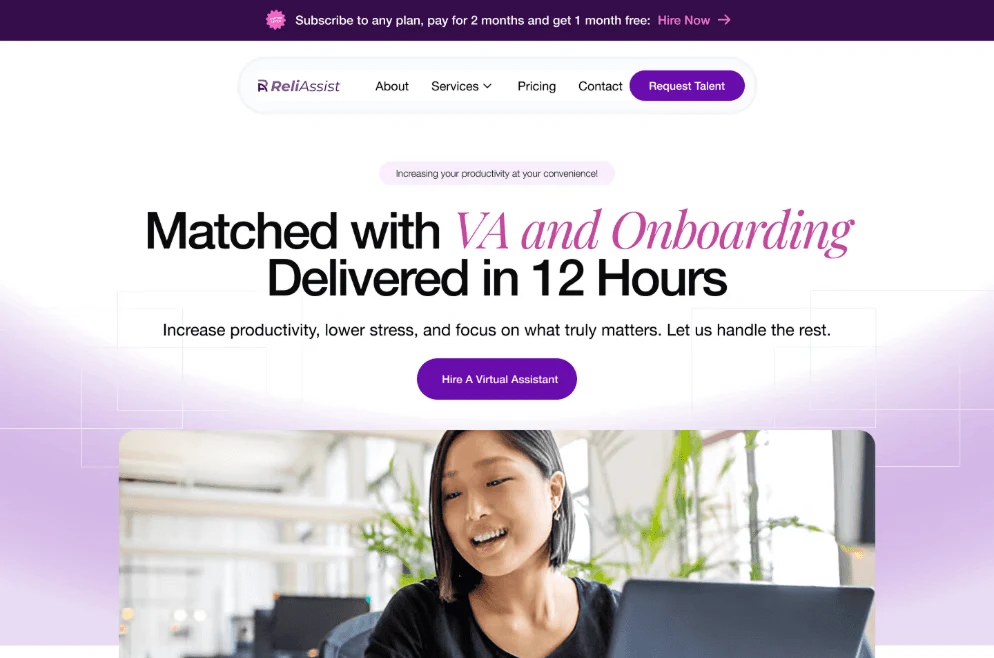
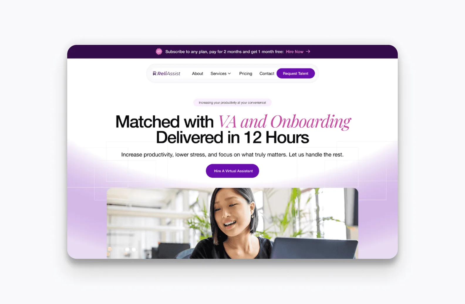
The homepage is the entry point for clarity. Concise messaging, strong hierarchy and clear calls to action tell visitors what ReliAssist offers within seconds of landing.
01Built for scanning
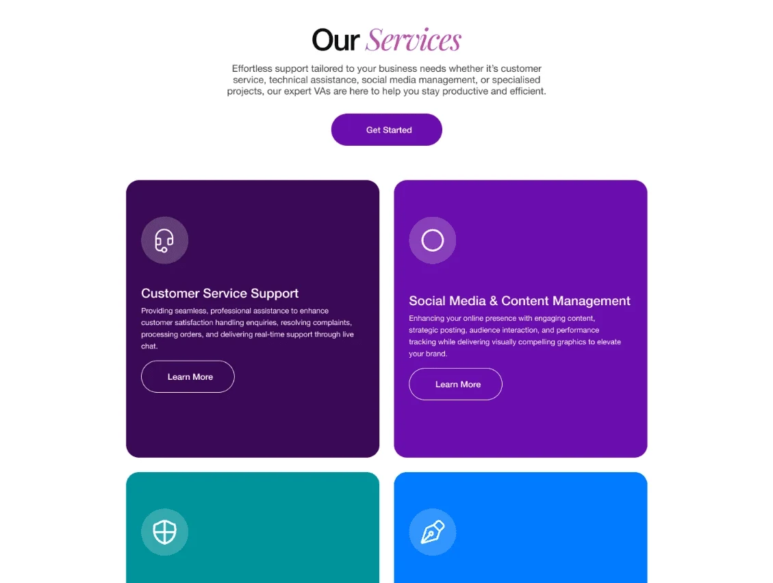
Each service section breaks the offer into simple blocks, so visitors can compare options without reading everything. Pricing follows the same principle, with structured cards and clear feature breakdowns.
02Calm by design
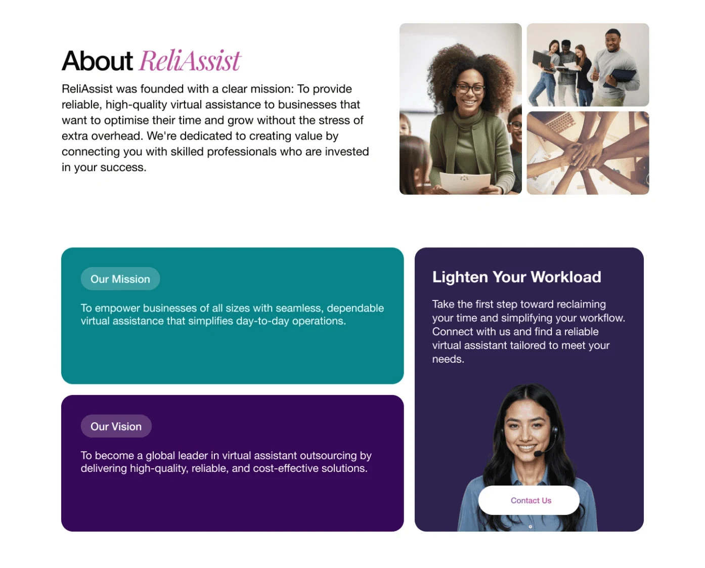
Every layout decision considered readability, responsiveness and cognitive load. The visual system uses modern typography, consistent spacing, rounded elements and a restrained palette. It reads as professional and still feels approachable.
03Working together
I worked closely with developers and stakeholders so design decisions stayed practical and aligned with business goals. Feedback from each side shaped the iterations.
04The hard part
Services need detail, and detail overwhelms. Finding the balance meant refining layout density and content priority again and again until each section said enough and no more.
The project reinforced how much clarity and structure influence trust in a service business. Every section exists to guide, not just to display.
Screens (03)